Here's a few things to make up for my absence from Blogger this semester. In a week or so I should have a more proper junior year wrap-up with all manner of giant pieces of paper. You know, assignments and things.


 I was intrigued by Angela Rizza's technique of traditionally inking and digitally coloring her pieces, so I decided to try it out for the last two projects of the semester. The scenes above and below were completed in this way...it's definitely something I'll have to try a few more times to really get.
 Some adaptations of medieval gargoyle designs into characters. I didn't have to change much about them at all- gargoyles are truly one of my biggest inspirations in character design.
 An extremely quick Christmas card illustration, and a mini-test of the digitally colored line technique.


 Two WIPs/color mocks for my final project in McKissick's Electronic Illustration class. In short, I'm illustrating a few images of Leshy, a mischievous Slavic woodland spirit...the finals and preliminaries will get their own blog post in due time. :]
 A few experiments with ink application from figure drawing.
 A commission and media experiment- who could pass up the chance to draw a flamingo in a fedora? India ink, colored pencil, and watercolor.
 Iconography for my Design for Illustration class with Walter King, created in Illustrator.
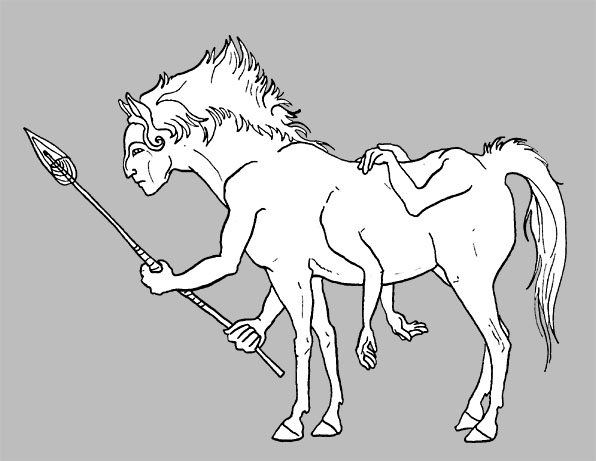
 Some bus-scribbles related to re-reading Pullman's 'His Dark Materials'. These are Mulefa, creatures with a diamond-shaped limb structure. The wheels/seedpods they use for transportation are pictured incorrectly here- they're supposed to be more like this. Ah well, at least I got the body structure mostly figured out.
 In closing, a cute little 'yote for you!
 It all started with this guy. In Mr. Kovach's illustration methods class, we were to design a narrative sculpture, creating a character or scene and a schematic to accompany it. Admittedly, I was rather frazzled at the time it was assigned, so I chose two guide words for myself and went with it: Kangaroo vulture.
 With the final schematic on display, I set about making a wire and foil armature, sculpting directly onto it with Super Sculpey and gluing it to a wooden board for support. I didn't get any photos of the sculpting process, unfortunately, but here's a few of the final sculpt and the primed sculpt:

 good movies
 This was my first real attempt at full-blown sculpture, so it was very much a learning process. Things could have gone a lot worse, especially considering I had no idea what I was doing with the wire armature supports, so I'm thankful the entire thing didn't break under its own weight!
 Vulturoo wouldn't be smiling anymore!
 Some weird thing for digital illustration class.
 Studies from my last class with Mr. Pirasteh! Charcoal on toned paper.
 Story time! A friend showed me a wonderful little font, Kingsthings Gothique, and when we had a label design project, I HAD to use it. A barn owl came to mind when I was thinking of design elements, so, in a brilliant stab in the dark, I searched for a barn owl beer. Lo and behold! I am such a lucky person sometimes. This is my first completed project in Illustrator.
  We have to CRAM for our advertising and graphic design classes, so it's truly surprising when things don't turn out half bad. I drew and inked these by hand and scanned them into photoshop for a quick coloring job. Type was added later, but I left it out for presentation purposes [read: it looked better without]. My roomies and I have affectionately named the pelican piece "Our Oceans are Filled with Tank Tops", as I cannot properly render a plastic bag. B)

 Holy mother of god OWLS. Their faces are full of fantastic design elements; I have a fun personal project coming up involving various species and shapes. Above is a page from my sketchbook completed yesterday. These owlmen are a bit creepy looking...trying to work that out. The strangely stylized central one is definitely not a homage to Erika Signini...
 These are some very quickly drawn preliminaries for my lammergeier painting a few weeks back. I really do like the kori bustard guy; might have to do something more with him someday.
 HEY LOOK, I committed one of my biggest pet peeves; drawing the figure at a 3/4 angle and the wings in profile. Silly me. The point of this angel was to develop a wing design which has been flopping around in my brain for a while.
 This, dear viewer, is the horrific land of my anthropology class notes, all 'shooped together in one foul mess. You'll quickly note that I draw the same thing over and over again: "EVERYONE LOOK TO THE SIDE AND MAKE A WEIRD FACE."
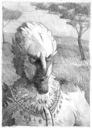
 My second finished project for Illustration methods class, "Lammerguyer", 9x12 in acrylics on illustration board. The assignment was to create a human-animal hybrid (hehe) and use good lighting reference to make it look realistic. I based mine on a lammergeier, or bearded vulture. There are things I did decently and things I did flat out incorrectly in this piece, but I consider it my first successful acrylic painting! Here's the graphite value study I did beforehand.
 The school gave us these cute little planners with toned paper covers. More of my dragonbeastie!
 My figure drawing instructor had us use charcoal on watercolor paper for an hour-long exercise. Definitely going to try this more often...In real life, you can see the awful smudgy grays created when badly using white and black charcoal together, and I plan to be more attentive next time.