
Look, I've lied already; there's no centaurs here, just cardinals being mean to a sparrow. This is the sixth part of my sparrow series for color concept, the goal this time being to take an analogous color scheme and 'break it' with a compliment (red, in this case). I'd upload the seventh part, but it's embarrassingly ugly. I hope you understand. That aside, I feel that this is one of my most successful pieces to date. Working on it felt good, and it was fun. I'm not sure if that feeling comes from the massive amount of experimentation involved, the amount of planning I did beforehand, or if it was just one of those things...The media used here were gesso, watercolors, india ink, micron ink, colored pencil, and gel pen, and the size is 6x9" like the others in the series.

I'm all about the birds lately, I guess! This was for an art card trade on Deviantart. A lammergeier-caracal character. No quips from me!
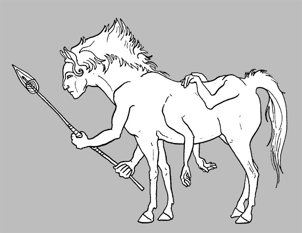
Below is me learning how to draw horses. The horse-bodies are mostly photo referenced (which I can thank my friend Katie Langford for), and the human torsos are not. The hands are so appallingly bad in all of these, I NEED to apologize. This will not happen again. Also, the levels of seriousness between each picture fluctuates greatly.


I love the movement in the last centaur sketches. The one jumping is very nice. I guess I never thought about a centaur jumping before I saw this. You did a good job capturing it!
ReplyDeleteThank you, Amanda! I'm quite fond of those sketches myself, so I'm glad someone else likes them too. <3
ReplyDelete